Moving elements on mobile/desktop using CSS
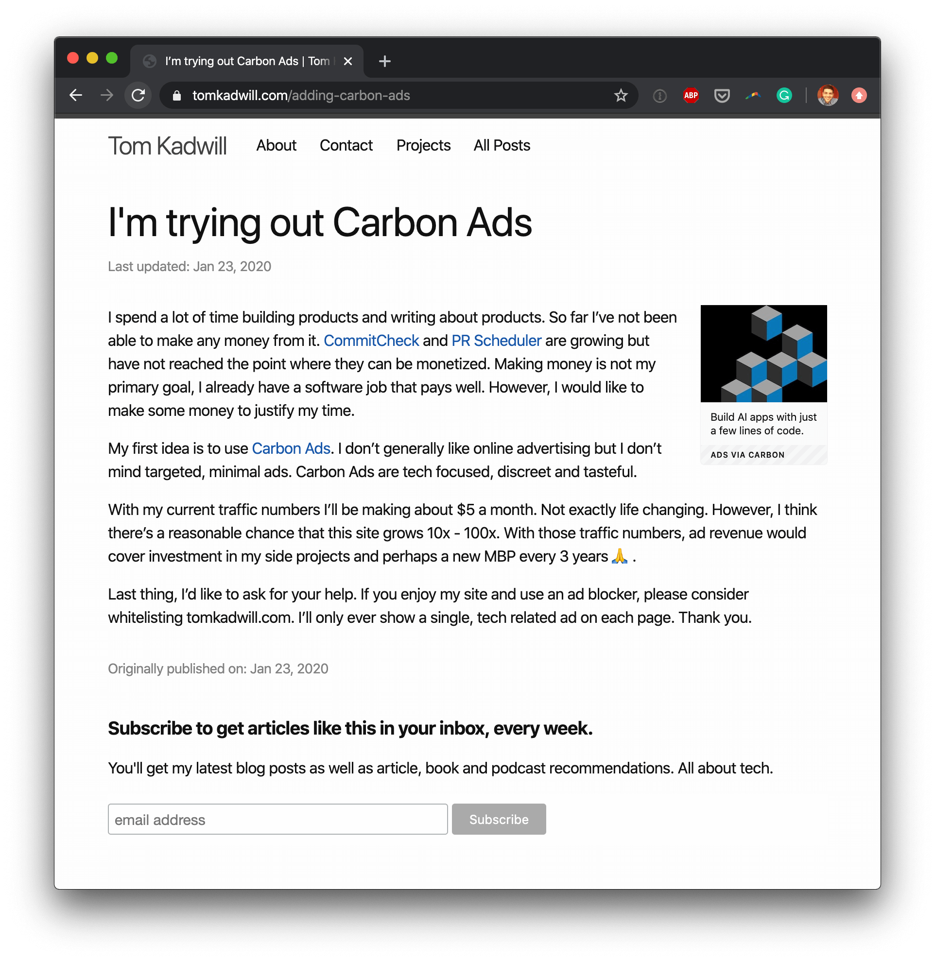
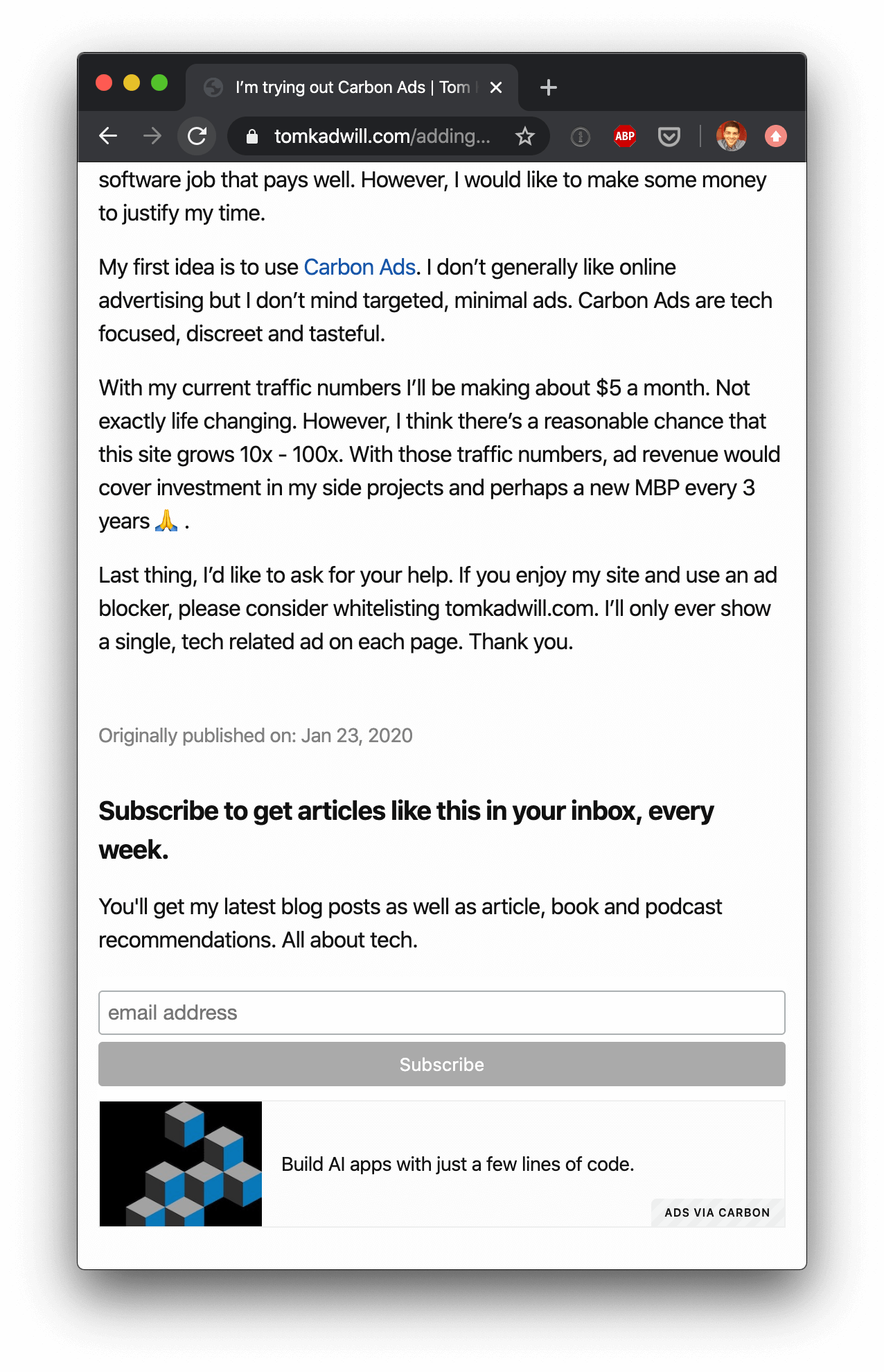
Yesterday I talked about adding Carbon Ads to the blog. On desktop the ad sits at the top right and on mobile it moves to the bottom of the page. I stole the idea from kottke.org, I think it’s a great design. I implemented it using media queries and flexbox. Let me show you how I did it.
What are media queries and flexbox?
Media queries allow you to conditionally apply CSS styles depending on the screen resolution. I’m using max-width: 768px and min-width: 768px which roughly equate to desktop and mobile.
Flexbox is a CSS module that gives a container the ability to alter it’s items (wight, height and order). In my case I’m using it to change the order of the ad and blog content.
My setup
First, I moved the ad, blog content and mailchimp form elements inside a flex container.
<div id="flex">
  <div id="carbonads"></div>

  <div class="post-content">
    <!-- blog content -->
  </div>

  <div class="mailchimp-signup-form">
    <!-- Mailchimp signup form -->
  </div>
</div>
In the CSS I added separate carbon ads styling to each of the media queries; one for desktop and one for mobile. For mobile I also used flexbox and change the order of the elements. display: flex enables flexbox on the container div and flex-direction: column means that the elements will be ordered vertically. Then I specify the flex order, I give #carbonads an order of 3 so that it moves to the bottom of the page.
@media only screen and (max-width: 768px) {
  #flex {
    display: flex;
    flex-direction: column;
  }
  #flex > #carbonads { order: 3; }
  #flex > .post-content { order: 1; }
  #flex > .mailchimp-signup-form { order: 2; }

  /* carbon ads bottom banner styling... */
}

@media only screen and (min-width: 768px) {
  /* carbon ads top right styling... */
}
Here is what it looks like:


This is the first time I’ve used Flexbox and I’m impressed. Check out css-tricks.com for a guide to Flexbox and you can read more about media queries at developer.mozilla.org.